ST33LE
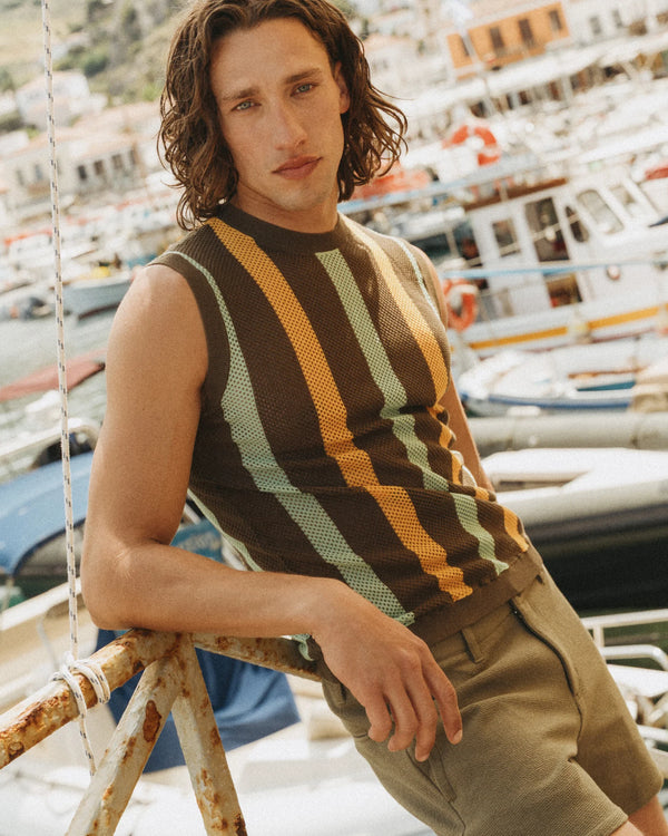
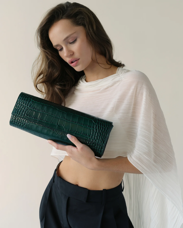
st33le.comST33LE already knew how it wanted a man to feel: confident, at ease, a little provocative, never overworked. The brand sits at the intersection of modern menswear, performance, resort dressing and a more sensual approach to fit — engineered prints, bold color, shorter proportions, body-conscious silhouettes and a point of view far more specific than generic vacation wear. Our job was to make the website feel equally specific. Not louder. Sharper, more editorial, easier to shop, and much more aligned with the sophistication of the product.
The brand was already expressive
ST33LE did not need help becoming noticeable — the color, the prints and the attitude were there. What the digital experience lacked was enough restraint around those elements for them to feel elevated. That became the central idea behind the redesign: the product could be bold, the interface should stay composed. We built the site around a cleaner luxury framework so color, body, movement and campaign imagery could do the expressive work — the visual discipline of brands like Orlebar Brown, Ron Dorff and CDLP, but still unmistakably ST33LE.
Sexy is stronger when it is controlled
There is a fine line between sensual and obvious, and ST33LE works best on the first side of it. The brand has a strong following among affluent, fashion-conscious gay men, but the opportunity was larger than positioning the business around one audience alone. The site preserves confidence and sensuality while making the brand feel broadly desirable and culturally fluent: less signaling, more confidence; less decoration, more body; less explanation, more point of view. Specificity creates desire — generic inclusivity rarely does. The brand can know who loves it without telling everyone else it is not for them.
A resort brand should feel like somewhere
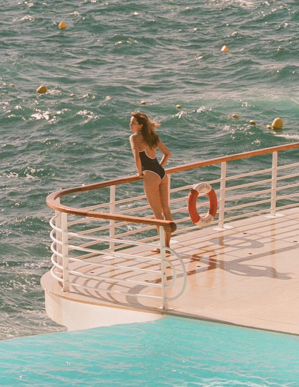
ST33LE is inherently geographic — sun, pools, hotels, terraces, beaches, late afternoons. We leaned into that atmosphere through larger campaign imagery, stronger editorial pacing and more room for photography to establish mood before product takes over. The website needed to sell shorts, swim and resortwear — but also the place those clothes seem to belong. That is the difference between showing a product and creating desire around it.
The homepage needed a point of view
We treated the homepage as a sequence rather than a stack of promotional blocks. A strong image creates the world; product creates the first opportunity to enter it; campaign moments add context; collections create structure; merchandising turns interest into movement. The customer should be able to feel the brand before being asked to process the assortment.
The shorts are the signature
Every fashion brand has something customers instinctively associate with it, and for ST33LE, shorts are one of those pieces — they help define the silhouette of the brand. Instead of presenting them as a flat assortment, the site communicates proportion, print, fabrication and the confidence of the fit, while the visual consistency of the grid keeps the collection easy to browse. A signature category should feel recognizable before the customer even reads the product name.
Prints need room to register
Engineered print is one of the clearest ST33LE differentiators, and prints demand attention — too many placed tightly together flatten into noise. We used clearer product spacing, consistent image treatment and a more controlled grid so each pattern registers independently. The interface creates a pause between products, and that pause matters: one print feels considered before the customer encounters the next. The result is more luxurious because the site is doing less.
The collection page had to work harder
The collection experience was one of the most commercially important areas to improve. We approached it as a working merchandising surface: customers can scan quickly when they know what they want, but the grid leaves room for discovery, with clearer filtering, stronger category organization and consistent product presentation. Good filtering should almost disappear — the customer feels the result, not the system. And because ST33LE is naturally styled in combinations, shop-the-look merchandising creates natural routes toward a larger basket: the brand finishing the look, not pushing another item.
Product pages needed more confidence
A menswear PDP can become surprisingly technical — fit, fabric, rise, length, stretch, lining, care. All of it matters, but dumping every detail into the first screen makes the product feel more complicated than it is. The first job is visual: show the shape, the body, the print, how it sits. Then answer the practical questions. Fit information is never buried, because ST33LE's body-conscious proportions are part of the point of view — the customer should understand whether something is close, cropped, relaxed or designed to reveal more of the body. For a brand built around confidence, uncertainty around fit is especially damaging.
Image consistency became a luxury issue
Luxury perception is cumulative. One weak crop, one overly compressed hero, one image with a different proportion — individually minor, together they create friction. We treated image consistency as part of the visual system, refining hierarchy and presentation so the experience feels intentional from campaign imagery down to product. A premium brand cannot feel premium only in the hero.
Mobile had to move faster
ST33LE is visual and socially discovered — a customer may encounter the product on a phone, browse three collections and decide before ever opening a laptop. The mobile experience needed fewer interruptions and faster access to what matters: cleaner navigation, stronger image hierarchy, simpler product selection, less friction between seeing and shopping. Performance received the same judgment — large images create impact but also weight, so richness was applied only where it contributes. The best performance work is invisible; the customer simply feels that the store responds.
SEO stays underneath the brand
Menswear eCommerce is competitive — men's swimwear, men's resortwear, designer swim are commercially meaningful terms — but forcing those phrases into every headline would weaken the voice. Clear collection naming, useful descriptions, strong internal linking and consistent metadata make the site legible to search engines without sounding like it was written for them. The same clean product structure — fabric, fit, category, print, color, use case — prepares the brand for AI-assisted discovery, where a customer may soon ask which brands make bold men's swimwear with a tailored fit. The customer experiences confidence and style; the structure underneath is precise.
The result
We created a digital experience designed to bring ST33LE closer to the brand it was already becoming: more elevated without becoming restrained, more sensual without becoming obvious, more editorial without becoming difficult to shop, more commercially intelligent without feeling transactional. The product remains the loudest thing in the room; everything around it became more considered. Confidence, better edited.
Features — Availability-Aware Size Filtering · Structured Color Swatch System · Shop-the-Look Merchandising · Mobile-First PDP Gallery · Editorial Campaign Integration
Partners — Shopify