Men's clothing brand website design has quietly become one of the most sophisticated corners of ecommerce because the menswear customer has changed. He researches construction, studies fit and fabric, buys across a longer consideration cycle, and rewards brands that respect his intelligence. The best menswear ecommerce websites share a design language built for that customer: editorial confidence, material storytelling, precise merchandising and interfaces that feel engineered rather than decorated.
At Exhibea, our work across luxury menswear, performance apparel and modern sportswear — including AndersonOrd, Holderness & Bourne, Postmarc and The Elder Statesman — has reinforced the same principle: a great menswear website has to communicate product intelligence and brand identity at the same time. This guide looks at what the strongest men's fashion websites get right, from branding and product pages to Shopify architecture and conversion.

What makes a great menswear website?
The best menswear website design is restrained without being generic. It creates enough structure for the customer to understand the product immediately, while giving the brand enough room to establish a distinctive world.
- Structural grids. Clean, consistent product grids and disciplined spacing make large assortments easier to understand. In menswear, visual order communicates confidence.
- Restrained typography and color. Strong menswear sites often let typography, proportion and photography carry the identity rather than relying on excessive interface decoration.
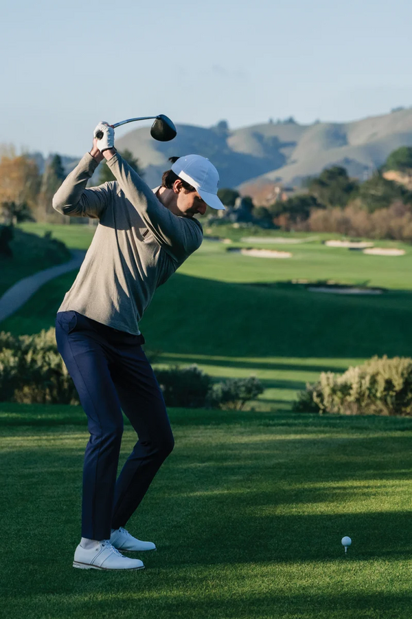
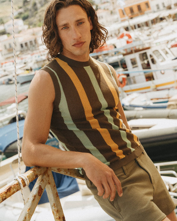
- On-body photography with useful fit information. Menswear lives and dies on fit. Model height, size worn, multiple angles and photography that honestly shows proportion and drape can remove uncertainty before purchase.
- Material and construction storytelling. Fabric, weight, weave, finish, origin and construction can all justify value. Houses such as Loro Piana have made material expertise central to their luxury positioning; digital-first menswear brands can apply the same principle on the product page.
What the best menswear brands teach about ecommerce design
Brunello Cucinelli: sell the worldview, not only the garment
Brunello Cucinelli demonstrates the power of placing a larger philosophy around the product. Craftsmanship, place, culture and the world of Solomeo give the clothing context beyond silhouette or material. At the highest end of menswear, the customer is rarely purchasing utility alone. The lesson: luxury menswear branding becomes more powerful when the product belongs to a clearly articulated world.
Todd Snyder: editorial merchandising
Todd Snyder combines menswear retail with the instincts of an editor. Tailoring, collaborations, seasonal stories and styling are merchandised together so the site feels less like a warehouse and more like a highly considered men's store. The lesson: do not leave the customer alone with a product grid. Curate, style and explain what matters.
Buck Mason: construction without pretension
Buck Mason pairs California ease with a serious emphasis on quality and modern American essentials. The presentation is straightforward because the product story does much of the work. The lesson: product education does not need to sound technical or self-important. Explain why something is made the way it is in language a customer actually wants to read.
Aimé Leon Dore: world-building as ecommerce strategy
Aimé Leon Dore demonstrates how a fashion website can become an extension of culture rather than simply a sales channel. Lookbooks, New York references, collaborations, physical spaces and the brand's café all contribute to a recognizable universe. The lesson: the strongest fashion ecommerce websites make commerce feel like entry into a sensibility.
Sporty & Rich: the modern lifestyle model
Sporty & Rich turns everyday apparel into a broader lifestyle proposition through recognizable graphics, wellness language, editorial imagery and a consistent visual world. The lesson: essentials become more valuable when they belong to an identity customers understand immediately.
Menswear product page design: where conversion happens
A great menswear product page should operate almost like a beautifully designed specification sheet. The customer wants inspiration, but he also wants answers.
- Fit guidance that commits. “True to size,” “take one size up for a relaxed fit,” or similarly clear guidance reduces ambiguity. Include model height and size worn wherever possible.
- Garment measurements. Body-size charts alone are often insufficient. Detailed garment measurements allow experienced customers to compare a new piece against something they already own.
- Fabric and construction details. Fiber composition, fabric weight, weave, wash, finish, mill or manufacturing details can all help the customer understand why the product costs what it does.
- Styling context. Complete-the-look, “wear it with” and editorial styling modules can increase discovery while showing the customer how a piece fits into his existing wardrobe.
- Restock and waitlist mechanics. Menswear staples often operate on replenishment cycles. Back-in-stock capture turns unavailable sizes into future demand rather than dead ends.
Menswear navigation and merchandising architecture
Men's fashion inventories frequently need to work across several overlapping systems: product category, fit, fabric, activity and occasion. A customer might know he wants trousers, while another knows only that he needs something for a summer wedding or a weekend away. The strongest men's clothing ecommerce websites support both behaviors.
Collection pages should make meaningful filtering easy — size, fit, fabric, color and product type where appropriate — while editorial collections such as “The Fall Edit,” “Weekend,” “New Arrivals” or “Travel” create curated entry points for customers who want guidance rather than a filter.
Site search matters here as well. A customer searching for “oxford,” “selvedge,” “cashmere,” “performance polo” or “relaxed trouser” is providing valuable information about intent. Search, filtering and merchandising should understand the language of the category.
What Exhibea's menswear work has taught us
Different menswear categories require different forms of digital storytelling. Our work at Exhibea spans performance, golf, travel, sportswear and luxury — and each demands its own balance of product clarity and brand emotion.
AndersonOrd sits at the intersection of men's performance apparel and lifestyle, where technical product benefits need to coexist with an easy, aspirational brand experience. Holderness & Bourne operates in premium men's golf apparel, where fit, polish and product consistency are central to the customer proposition.
Postmarc approaches menswear through travel and modern versatility — the type of brand where styling, occasion and storytelling can turn individual products into a complete wardrobe. At the luxury end, The Elder Statesman demonstrates how material, craft and an unmistakable creative point of view can create value far beyond basic product functionality.
The common thread is that menswear ecommerce design cannot be separated from brand strategy. Navigation, photography, copy, product information, merchandising and technology all need to express the same idea about who the clothes are for and why they deserve a place in his wardrobe.
Shopify website design for menswear brands
For a menswear brand building on Shopify or Shopify Plus, the strongest architecture starts with structured product information. Metafields can organize fabric, fit, construction, care and model information so those details remain consistent across every product page and can also support collection filtering and merchandising.
A strong Shopify menswear website should also prioritize fast image delivery, mobile-first product discovery, intuitive variant selection, clear size guidance, search, back-in-stock capture and thoughtful cross-selling. The goal is not to add features for their own sake. Every part of the experience should either clarify the product, reinforce the brand or make purchasing easier.
Menswear branding beyond the website
The strongest men's clothing brands build a consistent world around the commerce experience: a recognizable photographic language, a distinctive editorial voice, thoughtful packaging and content customers have a reason to return to between purchases.
That content can include fabric stories, craftsmanship features, care guides, founder perspectives, travel journals, seasonal edits and styling advice. Menswear often has a longer consideration cycle than impulse-driven categories; useful editorial content keeps the brand present while the customer decides.
Frequently asked questions about menswear website design
What makes a good menswear ecommerce website?
A strong menswear ecommerce site combines disciplined design, clear navigation, excellent on-body photography, detailed fit information, material storytelling and fast performance. The best sites provide substantial product information without making the experience feel cluttered.
What should a men's clothing product page include?
A menswear product page should include model height and size worn, fit guidance, garment measurements, fabric composition, construction details, care information, multiple product views and relevant styling recommendations. The objective is to answer the questions a knowledgeable customer would ask in a physical store.
Is Shopify good for menswear and men's clothing brands?
Yes. Shopify and Shopify Plus can support both emerging and established menswear brands, particularly when product information such as fabric, fit, care and construction is structured through metafields. The platform can support editorial merchandising, advanced filtering, international commerce, CRM integrations and sophisticated product-page experiences while maintaining a streamlined checkout.
How is menswear website design different from womenswear?
Menswear ecommerce frequently places greater emphasis on fit, fabric, construction, repeatable wardrobe staples and detailed product information. The visual experience can still be highly editorial, but clarity and product intelligence are especially important to building trust.
How can a luxury menswear brand improve ecommerce conversion?
Start by reducing uncertainty. Improve fit guidance, product photography, garment measurements, material information, navigation and mobile usability before adding promotional tactics. For luxury menswear, stronger conversion should come from making the value of the product clearer rather than making the brand feel cheaper.
What should a luxury menswear website look like?
A luxury menswear website should feel confident, distinctive and highly considered rather than simply minimal. Typography, photography, whitespace, motion, merchandising and product information should work together to create a digital environment that expresses the same level of quality as the garments themselves.
Exhibea designs brands and Shopify flagships for luxury menswear and fashion houses, with experience spanning AndersonOrd, Holderness & Bourne, Postmarc and The Elder Statesman. We bring together brand strategy, storytelling, luxury ecommerce design and Shopify development to build digital flagships engineered for long-term growth. Start a conversation.